Thoughts fade in seconds
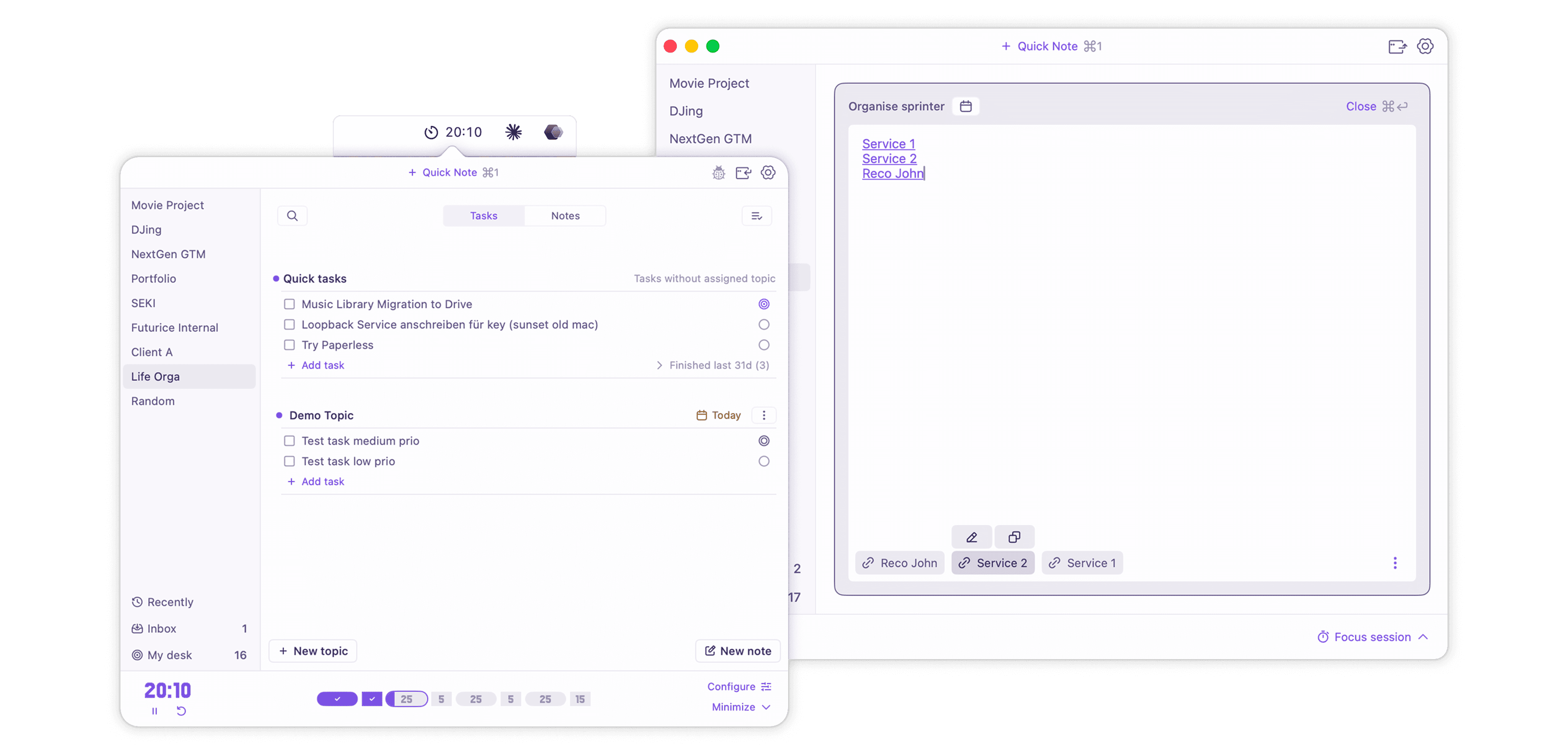
Thoughts can fade in seconds, so my “founding” target was to enable frictionless capture from hotkey to saved. Every extra click, app switch or long mouse path might lead to a dropped thought or hinder listening, since capturing this type of quick thought usually happens in meetings.
A few pixels from the menu bar
Quick Note sits centered in the header, right below the menu-bar icon that opened it, so the cursor barely needs to travel. Alternatively, there are hotkeys to access it. Capture the thought now and sort it into a project later, in the Inbox.
“KISS was drilled into me years ago by a senior colleague. With AI it matters more than ever, because an AI left to its defaults always wants to add more.”

Three states were one too many
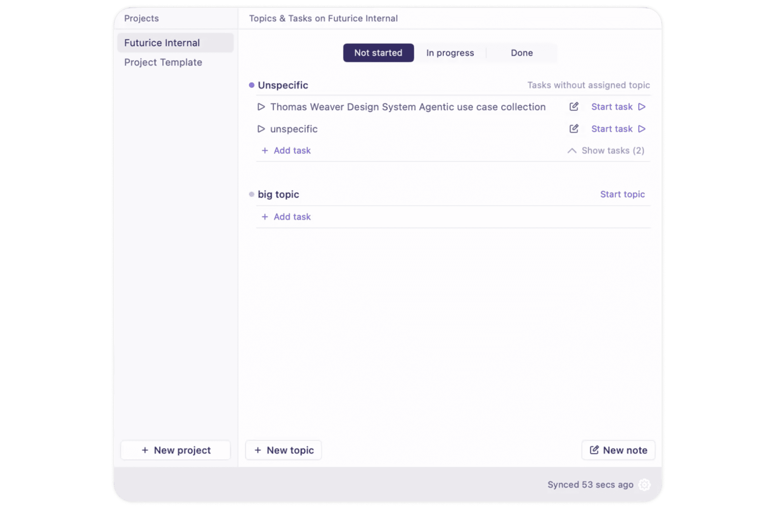
The “Not Started”-state was redesigned twice in May and became a “Backlog” tab in July. After my next public design critique session and personal struggles with untangling the UX, I cut it down to “In Progress” and “Done”.
Nothing lost on the way
Removing a state means moving real data. A one-time migration backed up everything first, then moved every waiting item into “In Progress”, so no work disappeared along with the tab.

Too(?) powerful notes
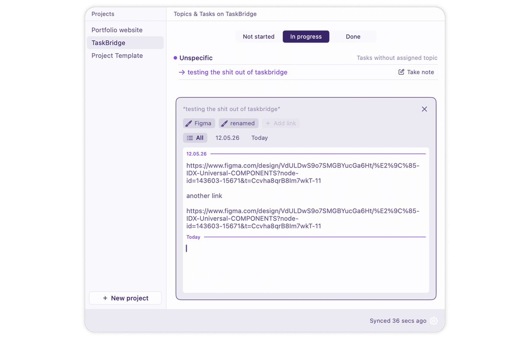
SEKI is special, because text can live inside tasks. They must be designed to hold real thinking without turning a task into a full-blown document editor. In June every day got its own entry, with date chips to filter them: structured, but heavy for what is usually a few lines. But something felt wrong.
One block, more room
Technical constraints settled it: many small entries made scrolling and text editing fiddly. I merged them into one continuous block per task. The slimmer version won white space, scrolls like a single page and edits like any text field.
Finding things without losing your place
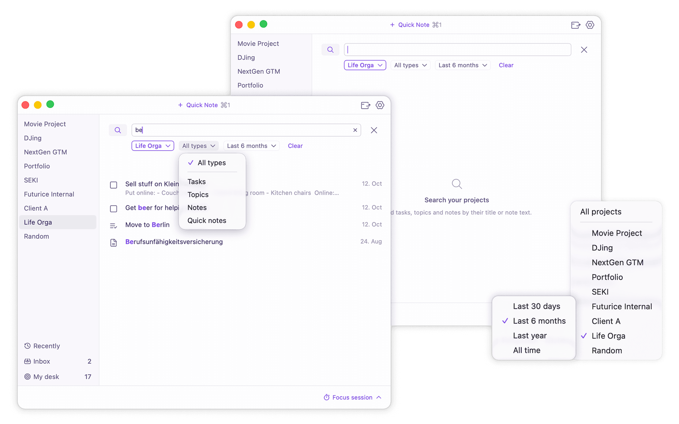
As projects fill up, finding a task or a note gets harder. A global search that dumps every match from every project might add noise, so designing search requires a lot of nuance. How, which filters are applied when, what kind of sorting is involved, how the user navigates results, while keeping the engine performant.
Search starts where you are
Search is a tab in the task bar. Opened from a project, or with ⌘F, it's pre-filtered to that project. Sorting and selected filters easily integrated. Recently edited items got a distinct view, based on my decision that these are user journeys triggered by actually distinct user needs.
The popover closes when I need it
A menu-bar popover closes as soon as you click into another app; that’s macOS behavior. For quick capture this fits just fine, but to write longer notes next to another window, it actually proved dysfunctional.
One product, two surfaces
The popover can pop out into a resizable, responsive window with a wider layout and four zoom levels. Only one surface can be live at a time, unsaved edits move with you when you switch and the window can easily be popped back into the menu bar again.
Built ahead of use
Responsivity and the window-mode took a lot of effort. It's a deliberate bet on long-form writing, and accounts for different types of behavior from the start without putting more “setup”-load on users.
Focus sessions
Focus sessions live in the footer, always within reach, and I designed them to stay thoughtfully quiet. Configuration is simple, but it needs more real-world feedback.
Automated Link-Detection
In modern work environments, people work with loads of links. Paste a URL into any text field and it becomes a chip named after its site. Hover it to copy the link or rename it. No dialog and no extra button needed.